CSS Grid tricks
Add columns for spacing on mobile
We have some content that we want to position in the center of the screen. For this we can use [[CSS Grid]]. By defining fixed values at the edges of our grid template we can achieve spacing without using
padding when the grid resizes on a smaller screen.Remember to add [[Meta viewport for mobile devices]], otherwise the content won't scale correctly on smaller screens and the spacings will not work.
<div class="grid">
	<div class="content">
      Elit suscipit consequuntur rerum alias eius. Autem soluta voluptas
      doloremque corrupti distinctio dicta Cumque sit accusamus minima magni
      voluptatum. Distinctio veritatis consectetur et eligendi dolores est
      Impedit at tenetur pariatur
	</div>
</div>
.grid {
display: grid;
grid-template-columns: 20px 1fr minmax(0, 960px) 1fr 20px;
}
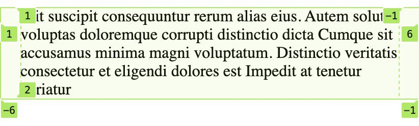
/* From the image below we can see that our content's
area starts at column 3 and ends at column 4 */
.content {
grid-column: 3 / 4;
/* This is a shorthand form of:
* grid-column-start: 3;
* grid-column-end: 4;
*/
}Here's the grid in desktop size with the grid columns highlighted using [[Chrome]]'s
grid tool.
The same grid on a screen size of
411px (Pixel 2 XL) displays that our 1fr columns are very small (or non-existent) at this point leaving only our "padding" columns and the content.